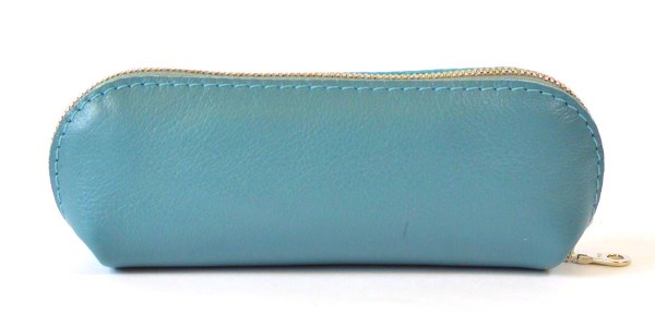
Paradise Island #5AA7A0 RGB Color Code
Name from the community color list.
Paradise Island (#5AA7A0) is a muted, medium teal. In RGB it is made of 35% red, 65% green and 63% blue (R 90, G 167, B 160). The green channel is the strongest. In HSL it has a hue of 175°, 30% saturation and 50% lightness. Its relative luminance is 0.323, so black text is easier to read on top of it. For print, a rough CMYK match is 46% cyan, 0% magenta, 4% yellow and 35% black. Check it against your printer's ICC profile before you print. It is a cool color. It goes well with warm oranges and reds for contrast. For a calm, matching look, use nearby cool tones.
Paradise Island color codes
#5AA7A0 in every common color format. Click a value to copy it.
| Format | Value | Copy |
|---|---|---|
| HEX | #5AA7A0 | |
| RGB | rgb(90, 167, 160) | |
| HSL | hsl(175, 30%, 50%) | |
| HSV / HSB | hsv(175, 46%, 65%) | |
| HWB | hwb(175 35% 35%) | |
| CMYK | cmyk(46%, 0%, 4%, 35%) | |
| OKLCH | oklch(67.7% 0.0774 187.87) | |
| OKLab | oklab(67.7% -0.0766 -0.0106) | |
| CIELAB | lab(63.43% -26.25 -4.19) | |
| CIELCH | lch(63.43% 26.59 189.06) | |
| Display P3 | color(display-p3 0.4271 0.6476 0.626) | |
| XYZ (D65) | color(xyz-d65 0.2438 0.3235 0.3822) | |
| Decimal | 5941152 |
CMYK here is a rough screen match without an ICC profile. See CMYK and print. Relative luminance: 0.3235. Nearest web-safe color: #669999.
Mix Paradise Island with other colors
See what #5AA7A0 makes with red paint, under a green light, printed with cyan ink and in a digital blend with blue. Click a picture to change the colors and amounts in the color mixer.
Use Paradise Island in your code
Ready to paste into CSS, Sass, Tailwind, iOS, Android and Flutter. Click the icon to copy a line.
| Where | Code | Copy |
|---|---|---|
| CSS variable | --paradise-island: #5AA7A0; | |
| Sass variable | $paradise-island: #5AA7A0; | |
| Tailwind CSS v4 | @theme { --color-paradise-island: #5AA7A0; } | |
| Tailwind CSS v3 config | colors: { 'paradise-island': '#5AA7A0' } | |
| SwiftUI | Color(red: 0.353, green: 0.655, blue: 0.627) | |
| UIKit | UIColor(red: 0.353, green: 0.655, blue: 0.627, alpha: 1) | |
| Android XML | <color name="paradise_island">#FF5AA7A0</color> | |
| Flutter and Jetpack Compose | Color(0xFF5AA7A0) |
Accessibility and contrast
Black text works best on #5AA7A0 (7.47:1, AAA). Here is how #5AA7A0 does as a text color:
Check this color against any background in the contrast checker. WCAG ratios and APCA Lc values measure different things, so one can't stand in for the other. Learn more.
How people with color blindness see Paradise Island
#5AA7A0 next to its complement and its two triadic colors, as seen with each type of color blindness.
- Normal visionhow most people see it
- Protanopiano red cones, about 1% of men
- Deuteranopiano green cones, the most common type
- Tritanopiano blue cones, very rare
- Achromatopsiano color at all, very rare
#5AA7A0 stays easy to tell apart from its complement and triadic colors for the common types of color blindness. Try your own colors in the color blindness simulator.
Paradise Island in a user interface
A sample app screen with #5AA7A0 as the main color, on a light and a dark theme.
Light theme
Dark theme
Buttons and bars use #5AA7A0 as it is. On the light theme, #5AA7A0 is too hard to read as text (2.81:1), so links, the badge and outline text use #34837C there (4.48:1). Build a full color scheme around it in the UI color preview.
Color harmonies for Paradise Island
These schemes turn the hue of #5AA7A0 around the color wheel. Each swatch links to its own page.
Complementary
Two colors on opposite sides of the wheel. This gives the most contrast.
Analogous
Hues that sit next to each other and look good together.
Triadic
Three hues spaced evenly around the wheel. Bold, but still balanced.
Split complementary
A base color plus the two hues on each side of its opposite. Strong contrast that clashes less.
Tetradic (rectangle)
Two pairs of opposite colors. Let one color lead and use the others less.
Square
Four hues 90° apart, spread evenly around the wheel.
Monochromatic
One hue at different levels of lightness and saturation.
Gradients with Paradise Island
Four CSS gradients made from #5AA7A0. Copy the code, or open one in the gradient generator to change it.
Soft tint
From a pale tint to the full color.
background: linear-gradient(90deg, #DFEDEB, #5AA7A0);
Deep shade
The color fading into a dark shade.
background: linear-gradient(180deg, #5AA7A0, #132C29);
Analogous
Its two neighbors on the color wheel.
background: linear-gradient(135deg, #5AA77A, #5AA7A0, #5A88A7);
Triadic
A bold blend with a triadic color, through a clean middle.
background: linear-gradient(135deg, #5AA7A0, #8884A4, #A05AA7);
Shades, tints and tones of Paradise Island
Shades are darker, tints are lighter and tones are grayer. We make them in OKLCH so the steps look even. Hover a step to see its code, or click it to open it.
Design system scale (50 to 950)
Paradise Island sits at step 400. Export the full scale as CSS variables or Tailwind tokens from the picker.
Closest RAL, Tailwind and CSS colors
The nearest match to #5AA7A0 in three color systems that designers and builders use.
ΔE is the distance in OKLab: under 2 is hard to see, over 10 is a clearly different color. Browse all RAL colors, the Tailwind palette or the 148 CSS color names. RAL values on screens are only a guide, so check a real color chart before you order paint.
Colors similar to Paradise Island
The named colors that look closest to this one (ΔE in OKLab). Browse all shades of teal or search the color library.